Sort of Sorted but Definitely Cold
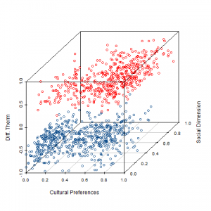
By now, students of American Politics have all become accustomed to seeing graphs of DW-NOMINATE scores showing ideological polarization in Congress. Here are the equivalent graphs (we assume two dimensions) at the mass level.
Data are from the 2004 ANES. Social and Cultural Preferences are from Confirmatory Factor Analysis over relevant items.
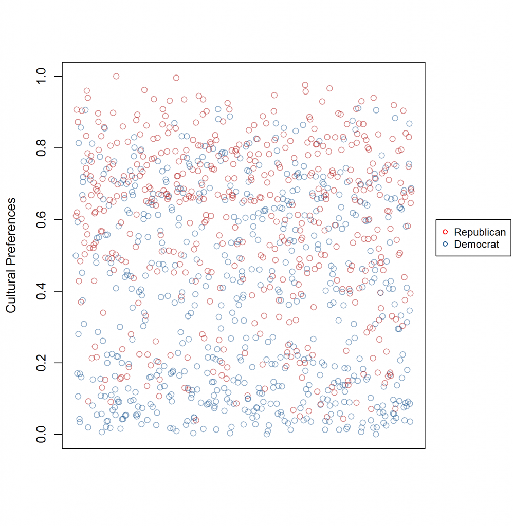
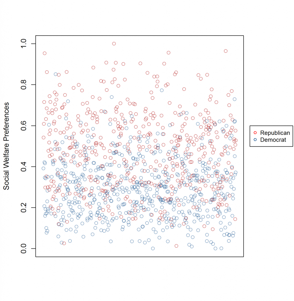
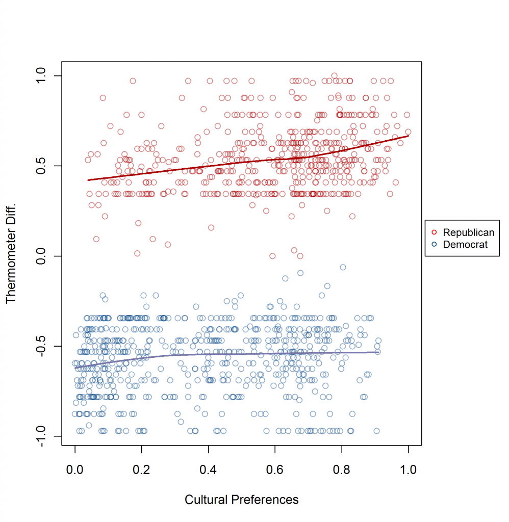
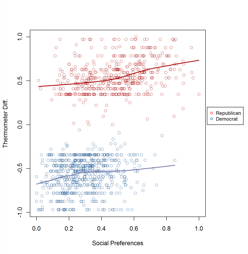
Here’s how to interpret the graphs:
- There is a large overlap in the preference profiles of Rs and Ds.
- Conditional on the same preferences, there is a large gap in thermometer ratings. Without partisan bias, same-preferences should yield about the same R-D thermometer ratings. And this gap is not particularly responsive to change in preferences within parties.